

Most Used AI Models in 2026: Data From 1,355 Krater Users
A readable view of model, provider, feature, image and video popularity among 1,355 Krater users.
Usage window: last 90 days to 2026-09-06. This is popularity data, not a quality ranking.

Key Takeaways
- This is a popularity story about 1,355 people using Krater during 90 days. They made 118,433 chat and agent requests across a product with 400+ models. The largest share belongs to
- Google accounts for 31.1% of provider requests, Anthropic for 26.6% and OpenAI for 24.2%. Together they describe the center of the product's current usage, while the remaining prov
- Claude Sonnet 4.5 received 4,325 requests from only 25 users. Claude Opus 4.8 received 4,111 requests from 208 users. The first pattern looks like a small group leaning heavily on
- Chat accounts for 67,260 requests. The agent loop accounts for 51,173, or 76.1% as many requests as chat. That is already a substantial amount of multi-step work, not a side channe
- Grok Imagine (edit) and Nano Banana 2 (edit) lead image popularity at 18.3% and 18.3% of image requests. Both are edit models. That pattern says users often start with an image and
- Video recorded 1,481 requests, far fewer than chat, the agent loop or image. Grok Imagine (image to video) leads the listed video models at 17.6% share, and Kling 3 (image to video
The main story: habits beat novelty
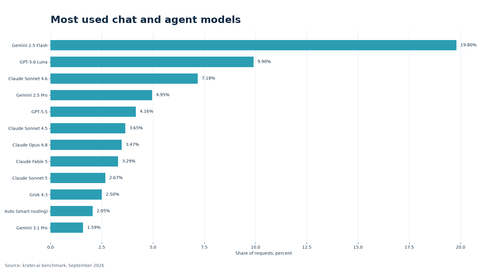
This is a popularity story about 1,355 people using Krater during 90 days. They made 118,433 chat and agent requests across a product with 400+ models. The largest share belongs to Gemini 2.5 Flash at 19.8% of chat and agent requests.
That first place needs a caveat. Gemini 2.5 Flash is the default model in new chats, so its share includes people who accepted the starting choice as well as people who selected it deliberately. The number tells us what many users encounter first. It does not tell us which model writes the best answer.
Google, Anthropic and OpenAI carry most requests
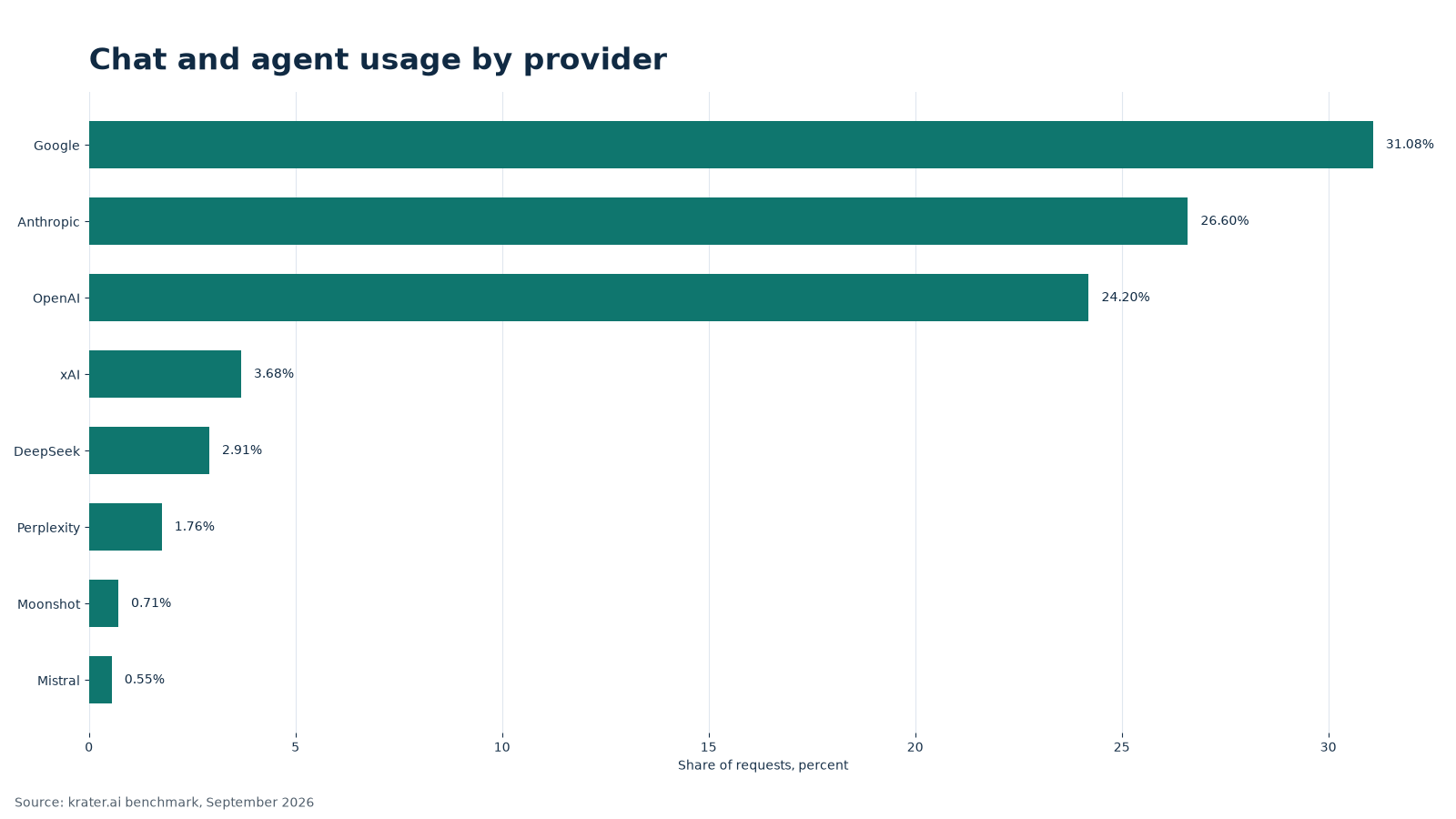
Google accounts for 31.1% of provider requests, Anthropic for 26.6% and OpenAI for 24.2%. Together they describe the center of the product's current usage, while the remaining providers serve smaller but still meaningful workflows.
| Provider | Requests | Users | Share |
|---|---|---|---|
| 36,811 | 819 | 31.1% | |
| Anthropic | 31,505 | 587 | 26.6% |
| OpenAI | 28,657 | 655 | 24.2% |
| xAI | 4,357 | 157 | 3.7% |
| DeepSeek | 3,451 | 167 | 2.9% |
| Perplexity | 2,083 | 131 | 1.8% |
| Moonshot | 841 | 32 | 0.7% |
| Mistral | 646 | 44 | 0.6% |
Requests and people are not the same thing
Claude Sonnet 4.5 received 4,325 requests from only 25 users. Claude Opus 4.8 received 4,111 requests from 208 users. The first pattern looks like a small group leaning heavily on one model; the second looks like broader adoption across more people. Request share alone hides that difference.
The same caution applies to every model row. A request measures activity, while a user count measures reach during this window. Neither column measures answer quality or proves that a model is right for a particular business workflow.
| Model | Requests | Users | Share |
|---|---|---|---|
| Gemini 2.5 Flash | 23,450 | 715 | 19.8% |
| GPT-5.6 Luna | 11,726 | 339 | 9.9% |
| Claude Sonnet 4.6 | 8,501 | 236 | 7.2% |
| Gemini 2.5 Pro | 5,862 | 108 | 5.0% |
| GPT-5.5 | 4,922 | 160 | 4.2% |
| Claude Sonnet 4.5 | 4,325 | 25 | 3.6% |
| Claude Opus 4.8 | 4,111 | 208 | 3.5% |
| Claude Fable 5 | 3,899 | 193 | 3.3% |
| Claude Sonnet 5 | 3,163 | 105 | 2.7% |
| Grok 4.3 | 2,961 | 102 | 2.5% |
| Auto (smart routing) | 2,430 | 79 | 2.0% |
| Gemini 3.1 Pro | 1,889 | 34 | 1.6% |
Chat is still the largest surface, but agent work is close
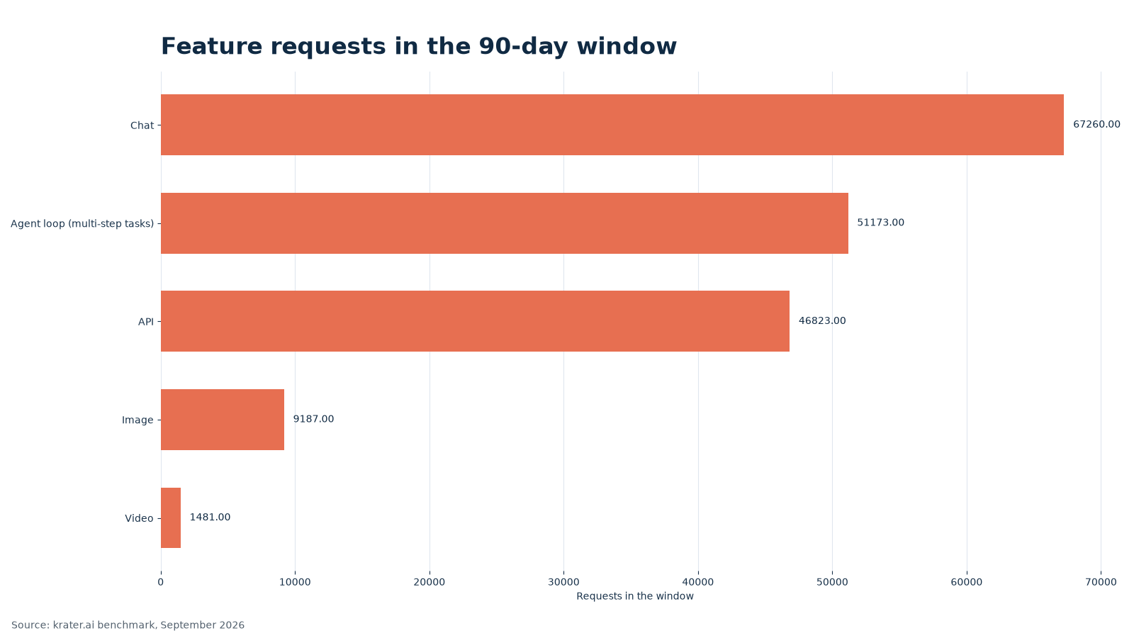
Chat accounts for 67,260 requests. The agent loop accounts for 51,173, or 76.1% as many requests as chat. That is already a substantial amount of multi-step work, not a side channel.
The API recorded 46,823 requests and exposed 397 models in this view. Image and video are smaller surfaces, but they matter because their workflows are different from a text conversation.
| Feature | Requests | Users | Models |
|---|---|---|---|
| Chat | 67,260 | 1,203 | 314 |
| Agent loop (multi-step tasks) | 51,173 | 1,056 | 367 |
| API | 46,823 | 146 | 397 |
| Image | 9,187 | 376 | 50 |
| Video | 1,481 | 258 | 48 |
Image usage favors editing
Grok Imagine (edit) and Nano Banana 2 (edit) lead image popularity at 18.3% and 18.3% of image requests. Both are edit models. That pattern says users often start with an image and ask the product to change, extend or improve it rather than creating from a blank prompt every time.
The next rows show a mixture of upscaling, generation and editing. These are usage signals, not a visual quality contest. A product photographer should still compare the exact source image, crop, lighting and approval standard before choosing a model.
| Image model | Requests | Users | Share |
|---|---|---|---|
| Grok Imagine (edit) | 1,684 | 38 | 18.3% |
| Nano Banana 2 (edit) | 1,681 | 78 | 18.3% |
| Crystal Upscaler | 955 | 61 | 10.4% |
| Nano Banana 2 | 795 | 79 | 8.7% |
| Nano Banana Pro (edit) | 661 | 25 | 7.2% |
| GPT Image 2 (edit) | 617 | 24 | 6.7% |
| Nano Banana Pro | 392 | 20 | 4.3% |
| FLUX 2 | 329 | 146 | 3.6% |
Video is smaller, and image-to-video leads
Video recorded 1,481 requests, far fewer than chat, the agent loop or image. Grok Imagine (image to video) leads the listed video models at 17.6% share, and Kling 3 (image to video) follows at 10.4%. Both are image-to-video workflows.
That suggests a practical starting point: users often bring a visual idea or source image and ask for motion, rather than beginning with text alone. It is a usage observation, not a claim about motion quality or consistency.
| Video model | Requests | Users | Share |
|---|---|---|---|
| Grok Imagine (image to video) | 261 | 21 | 17.6% |
| Kling 3 (image to video) | 154 | 26 | 10.4% |
| LTX-2 (text to video) | 130 | 78 | 8.8% |
| Kling O3 (text to video) | 114 | 38 | 7.7% |
| Veo 3 Fast (image to video) | 88 | 31 | 5.9% |
| Seedance 2.0 (image to video) | 75 | 39 | 5.1% |
Newer names are present, but familiarity still wins
Gemini 3.1 Pro and GPT-5.6 Luna appear in the popularity list, yet neither has the share of the familiar default and established model families. People tend to stay with a model they already know, especially when a saved workflow or a team habit is attached to it. Newer models can be useful without immediately becoming the most selected models.
For an operator, that means usage data can guide onboarding but should not decide a quality question. If the goal is to understand what people currently choose, this window answers it. If the goal is to choose the best model for a strict business brief, use the quality benchmark and run Compare.
What the provider split means for operators
Google's 31.1% share, Anthropic's 26.6% and OpenAI's 24.2% are close enough to describe a broad market rather than a single-provider habit. The request counts tell the same story: each family has enough activity to support different kinds of work, and the smaller providers add choice around the edges.
A provider percentage should be read with its user count. Google reaches 819 users in this view, Anthropic reaches 587 and OpenAI reaches 655. Those counts overlap because one person can use more than one provider. The figures describe product behavior, not exclusive market ownership.
For documentation, the practical consequence is breadth. A team that starts with one provider can still encounter another through a saved Persona, a comparison or a feature with a different model list. Keeping the provider label visible makes the report easier to understand when the model picker changes.
Popularity has several useful shapes
The first model has 23,450 requests from 715 users. Claude Sonnet 4.5 has 4,325 requests from 25 users, while Claude Opus 4.8 has 4,111 from 208. Those three rows show why a single ranking cannot explain adoption. Defaults, specialist habits and broad team use all appear as popularity.
The feature rows add another layer. Chat has 1,203 users, the agent loop has 1,056, image has 376 and video has 258. A person can appear in several rows, so these figures are reach signals within each feature rather than a customer total.
This is useful when deciding what to teach first. A high request count can justify a starter guide, while a high user count with fewer requests can point to a common first step. A small feature can still deserve good documentation if the work it supports has high stakes.
The window is a snapshot, not a forecast
The report ends on 2026-09-06, so it captures a specific period rather than a promise about the next quarter. A model can rise because a new feature makes it easier to find, because a team standardizes on it or because a few large workflows arrive at once. Those causes are invisible in a request total by itself.
The same limitation applies to the long tail. A model with a small share may be new, specialized or simply harder to discover. A model with a large share may be familiar because it is already in a saved workflow. Popularity is valuable precisely when it is read as behavior to understand, not as a verdict to obey.
For a team deciding what to support first, start with the models and features that have both reach and repeat activity. Then make room for a smaller model when it solves a job the leaders do not. That balance keeps onboarding grounded in observed use while preserving room for deliberate experimentation.
A useful way to read the tables
Read the model table from left to right. Requests show how often a model was used, users show how widely it reached, and share shows its place inside this reporting window. Read the feature table the same way. The numbers become more useful when the reader asks what kind of activity produced them.
That habit also prevents a common mistake: treating a small percentage as a failure. A specialist model may serve a narrow workflow very well. Conversely, a large percentage may reflect convenience or a default. The report is strongest when it helps a team ask the next question.
It is also why the window belongs beside the date and the feature name whenever these figures are shared publicly for this reporting window.
How to use the popularity picture
Product teams can use these numbers to decide which model needs clearer onboarding. Support teams can see which feature deserves better templates. Operators can spot whether a high request count comes from broad reach or a small group of heavy users. Those are useful decisions because they keep the numbers tied to the question they can actually answer.
In Krater, pick a model when you want an explicit choice, use Compare for the same brief across models and create a Persona for recurring voice and review rules. Use /research for supplied evidence, /image for visual directions, /video for motion concepts and /summarize for long notes.
For controlled quality scores and real business-task excerpts, read the business benchmark hub. This popularity report and that quality report answer different questions.
Keep those questions separate when sharing the numbers with a team, so popularity does not quietly become a quality claim.
Frequently Asked Questions
Is the most used model the best model?
No. This article reports request and user popularity. The business benchmark covers controlled quality scores.
Why is Gemini 2.5 Flash's share high?
It is the default model in new chats, so its share includes default selections as well as deliberate choices.
How many people are included?
The all-feature window covers 1,355 distinct users over 90 days. All-time users are higher.
Do image and video rows measure quality?
No. They report popularity in their respective request windows, not image or video quality.
Can provider share predict my team's best choice?
No. Use provider share to understand adoption, then compare models on the briefs your team actually ships.
Where are the quality scores?
Read the business benchmark hub for the quality comparison and method.
The Bottom Line
This window answers a popularity question: Gemini 2.5 Flash has the largest listed share at 19.8%. It does not answer which model is best. Use the business benchmark for quality evidence, then use Compare and Personas for a team-specific decision.